ING Georgia Marathon Poster Competition (Graphic Design Challenge)
This weekend there was an event at SCAD called Generate, aka the 24-hour marathon. As part of this marathon, there was a 13 hour challenge to create a poster for the ING Georgia Marathon. Now, I was a part of this competition last year, and ended up winning it, but this year, something changed. I was asked to take a different approach, instead of doing a vector-based illustration like in the previous year, this year they were pushing to have a bitmap based poster. No stock photography was allowed, but I figured that I could take my own photos, it's too bad that it was a rainy day in Atlanta and I couldn't get a pic worth anything.
After being conscious of my technical limitations, I went on to sketch. After coming up with a few different concepts, I ultimately went for creating a mosaic of the photography that was provided by the Georgia Marathon organizers. The photos were carefully selected to reflect not only the competitive spirit but also the involvement that the community has with the event. The result you can view below:
Art Director's Night (Advertising Design Challenge)
After 13 hours designing against the clock, I was a bit tired, but there were still 11 hours left, what was I to do if not work some more? So I went on to do the Ad Design challenge, which was to create a poster, a post card, and a site for Art Director's Night. This event is a night in which graduate and senior students get a chance to meet and be interviewed by some of the top art directors in Atlanta.
It took me a while to get this one. I couldn't get a right look down, but after a couple of hours and a few different directions, I started "getting it". So I created a headline that treated the students as the future superstars of advertising. This hypes not only the college, but also helps bring up the expectations of the panelists that were coming to view the students' work. The visual was reminiscent of a rock poster, and I kept it consistently through the poster, post card, and website. Check it out:
POSTER
POST CARD (FRONT)
POST CARD (BACK)
WEBSITE
Saturday, October 18, 2008
24 HOUR MARATHON (GENERATE)
Posted by
Mike Albuquerque
at
9:28 AM
0
comments
![]()
Monday, October 13, 2008
CNN
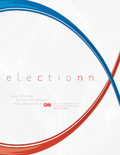
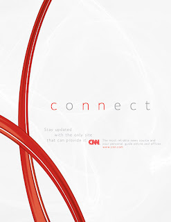
Here are some posters I did for an ad campaign that I did for my Business Practices of Advertising. CNN is obviously a well-known and respected brand, but I felt like I had to bring in some elements that could be consistently used. So I created these red stripes that emulate the lines in their logo. These stripes create an interesting element that is dynamic and introduces movement to the page. The background is white but has some highlights that also relate to the reflective nature of the stripes.
The concept of the ad is to convey that CNN is the only network that can bring you the insight to understand the news. By presenting key words with the letter "n" doubled and the c,n,and n highlighted in red, it stands out and give the idea that CNN is intertwined with those words.


The other one is a print ad for the show Anderson Cooper 360, a show that comes on every night on CNN and that goes more in depth with the headline stories.
Posted by
Mike Albuquerque
at
6:49 PM
0
comments
![]()
