ING Georgia Marathon Poster Competition (Graphic Design Challenge)
This weekend there was an event at SCAD called Generate, aka the 24-hour marathon. As part of this marathon, there was a 13 hour challenge to create a poster for the ING Georgia Marathon. Now, I was a part of this competition last year, and ended up winning it, but this year, something changed. I was asked to take a different approach, instead of doing a vector-based illustration like in the previous year, this year they were pushing to have a bitmap based poster. No stock photography was allowed, but I figured that I could take my own photos, it's too bad that it was a rainy day in Atlanta and I couldn't get a pic worth anything.
After being conscious of my technical limitations, I went on to sketch. After coming up with a few different concepts, I ultimately went for creating a mosaic of the photography that was provided by the Georgia Marathon organizers. The photos were carefully selected to reflect not only the competitive spirit but also the involvement that the community has with the event. The result you can view below:
Art Director's Night (Advertising Design Challenge)
After 13 hours designing against the clock, I was a bit tired, but there were still 11 hours left, what was I to do if not work some more? So I went on to do the Ad Design challenge, which was to create a poster, a post card, and a site for Art Director's Night. This event is a night in which graduate and senior students get a chance to meet and be interviewed by some of the top art directors in Atlanta.
It took me a while to get this one. I couldn't get a right look down, but after a couple of hours and a few different directions, I started "getting it". So I created a headline that treated the students as the future superstars of advertising. This hypes not only the college, but also helps bring up the expectations of the panelists that were coming to view the students' work. The visual was reminiscent of a rock poster, and I kept it consistently through the poster, post card, and website. Check it out:
POSTER
POST CARD (FRONT)
POST CARD (BACK)
WEBSITE
Saturday, October 18, 2008
24 HOUR MARATHON (GENERATE)
Posted by
Mike Albuquerque
at
9:28 AM
0
comments
![]()
Monday, October 13, 2008
CNN
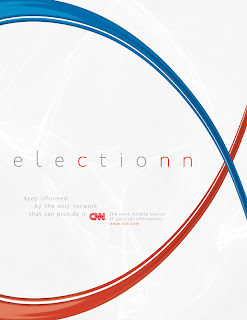
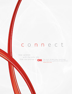
Here are some posters I did for an ad campaign that I did for my Business Practices of Advertising. CNN is obviously a well-known and respected brand, but I felt like I had to bring in some elements that could be consistently used. So I created these red stripes that emulate the lines in their logo. These stripes create an interesting element that is dynamic and introduces movement to the page. The background is white but has some highlights that also relate to the reflective nature of the stripes.
The concept of the ad is to convey that CNN is the only network that can bring you the insight to understand the news. By presenting key words with the letter "n" doubled and the c,n,and n highlighted in red, it stands out and give the idea that CNN is intertwined with those words.


The other one is a print ad for the show Anderson Cooper 360, a show that comes on every night on CNN and that goes more in depth with the headline stories.
Posted by
Mike Albuquerque
at
6:49 PM
0
comments
![]()
Wednesday, September 24, 2008
Adobe CS4
Adobe Photoshop Extended CS4 - Videos of the new features
Design Premium CS4
Web Premium CS4
Production Premium CS4
Photoshop CS4
Photoshop CS4 Extended
InDesign CS4
Flash CS4
Illustrator CS4
Dreamweaver CS4
Additional Videos
Content-Aware Scale
Spherical Panorama
3D Quick Look
3D Mesh from Grayscale
3D Eclipse Animation
Posted by
Mike Albuquerque
at
9:51 PM
0
comments
![]()
Tuesday, September 23, 2008
Experience Wii
I've gotta say that this actually caught me off-guard. Here I was expecting it to be a simple youtube video, but it was so much more. Do yourself a favor and check it out. It's a great use of the medium in a new way that will no doubt have an effect on the target audience. The movement and the overall feel of this is also completely consistent with the concept of Nintendo's console.
Experience Wii
As I watched this though, I remembered a project I did for New Media Art class in college. Our concept had to do with chaos, the second law of thermodynamics, and erosion. We designed a website that featured videos and content that related to that concept. After a minute or so, the website would start to fall apart. Paragraphs would disappear, images would turn into broken links, etc. It was a cool project, but not nearly as nicely executed as this one.
Posted by
Mike Albuquerque
at
10:22 PM
0
comments
![]()
Wednesday, August 27, 2008
Green Magazines
So I've been designing some websites for my Digital Studio I class. I figured I'd post it here. I enjoyed designing this site as I really went into depth regarding the style and the mindset of the target audience. This one is for a client that I've done some freelance for in the past, although the site was just done as a class project.
Here's the link for the full thing:
Green Magazines site
the one that's on the air right now I didn't design, but here it is for comparison's sake
Current Site
Posted by
Mike Albuquerque
at
2:56 AM
1 comments
![]()
Thursday, August 21, 2008
Motion Graphics DIN
So I've been trying my hand in some Motion Graphics because of my Typography Studio II class. Here's my first attempt at messing around with After Effects. It was an animated version of a poster I made for the typeface DIN 1451.
And here's the poster that led to the animation:
Posted by
Mike Albuquerque
at
10:07 PM
0
comments
![]()
Sunday, August 17, 2008
Video Enhancing Technology
This is truly amazing. It's funny because thinking about it, it almost seems obvious.
Using Photographs to Enhance Videos of a Static Scene from pro on Vimeo.
Posted by
Mike Albuquerque
at
9:19 PM
1 comments
![]()
